Recep Kütük

Refine Branding

Role
Brand Designer
Scope
Brand Identity, Logo Design

When I joined Refine in early 2023, it was an open-source React framework for building internal tools, made for experienced developers. The identity didn’t show it: next to the rest of the React ecosystem, it looked loud and generic. I started by auditing the logos around us, explored a direction based on the letter R, and landed on a logomark that sets the toggle from the old logo inside a hexagon that nods to React. I kept the core palette to black and white so the brand could stay neutral and fit anywhere it appeared, and added a wider set of accent colours for play. The rules are loose by design: the mark changes with seasons, events and places, and the style guide keeps it recognisable.
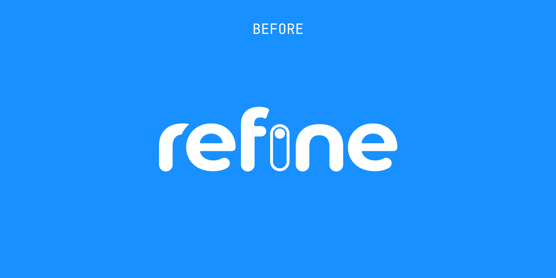
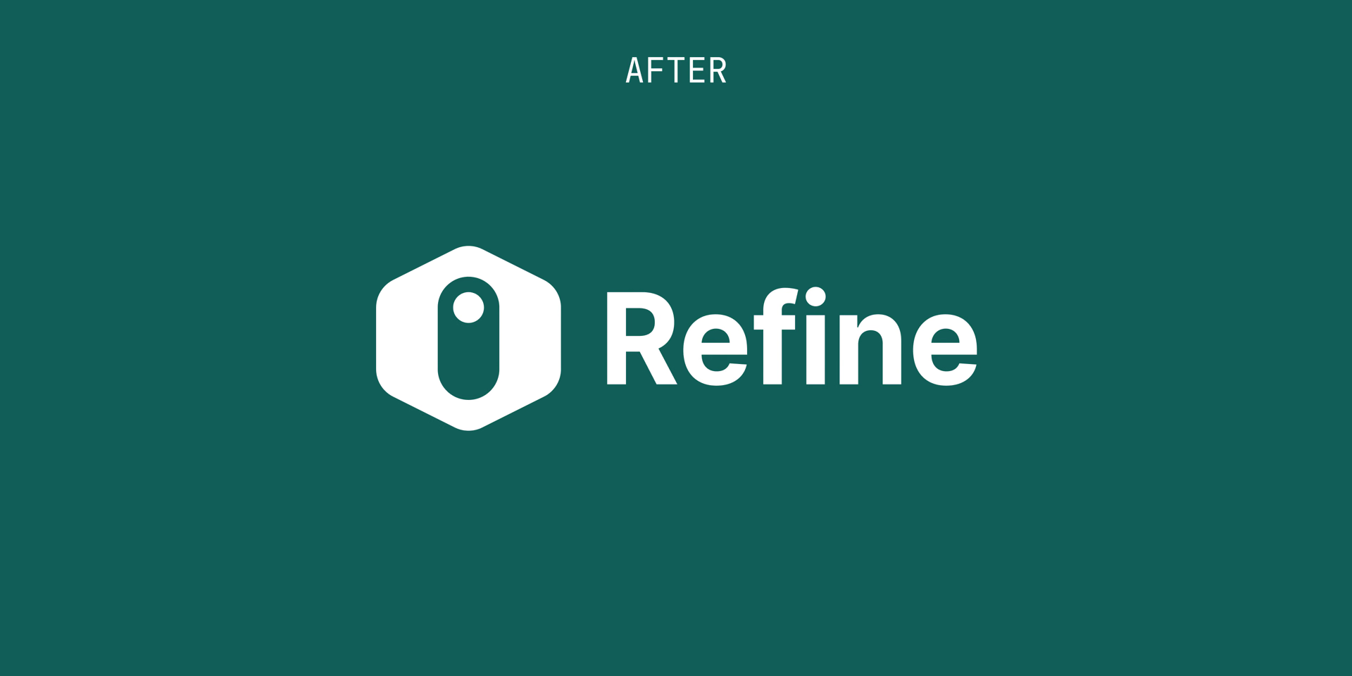
Before: the old Refine wordmark in white on blue, rounded lowercase letters with a toggle switch for the i. After: the new Refine logo in white on dark green, the toggle inside a hexagon next to a bold Refine wordmark.
The logo, before and after. The old toggle mark and the new hexagon around it.
The React logo at the centre of dashed orbits, surrounded by the logos of tools in its ecosystem, all drawn as outlines.
The landscape. The dominant logos in the React ecosystem: clean wordmarks, restrained palettes, geometric marks.
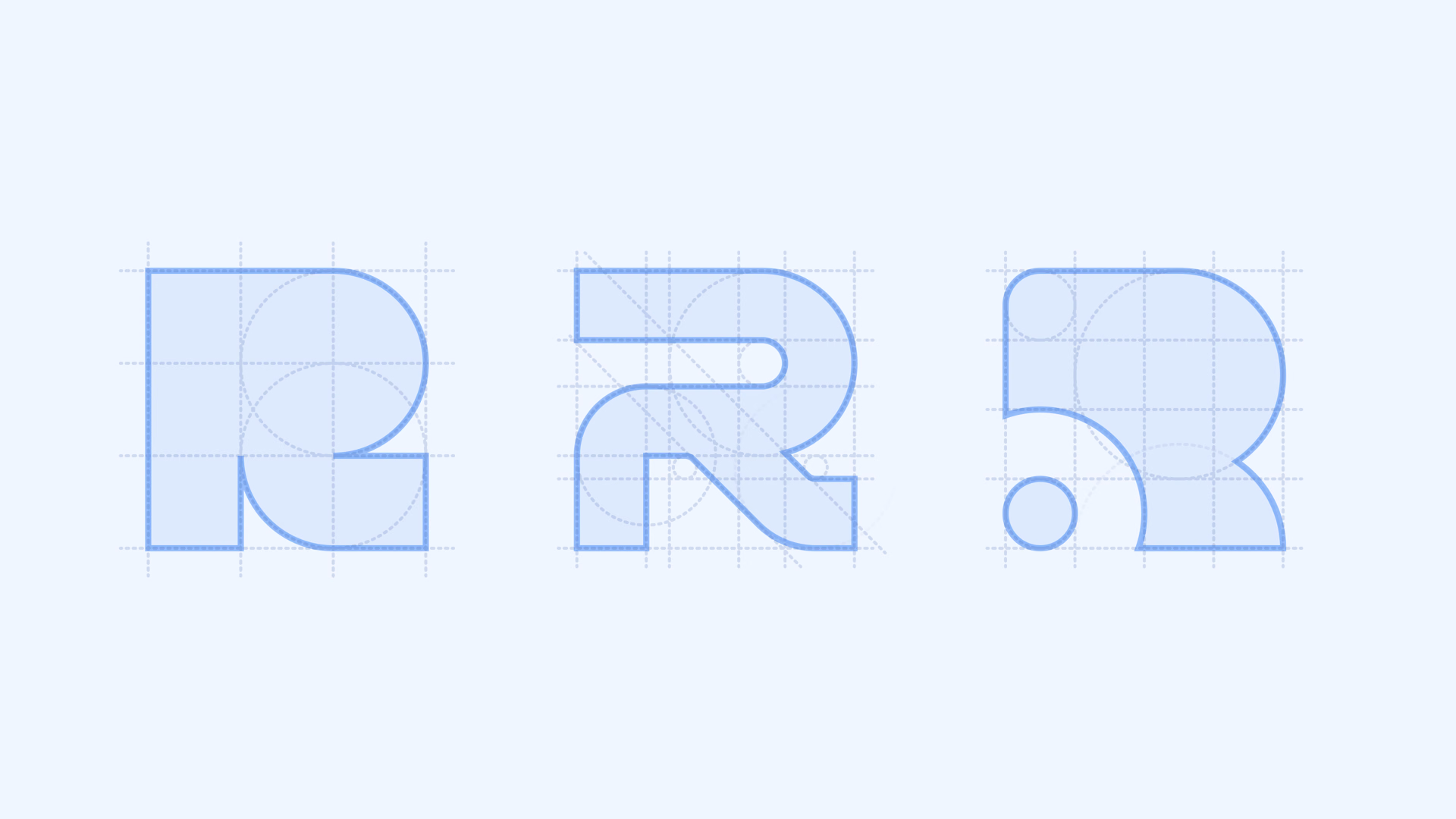
Three geometric letter R logomarks drawn on construction grids of circles and guide lines.
Early explorations. Logomarks built on the letter R, set aside because too many established tools already use one.
The React logo on a construction grid.
Origin. The React logo, turned 90°. Its orbits end in six circles of one size that the hexagon wraps, the upright orbit becomes the toggle, and the nucleus its knob.
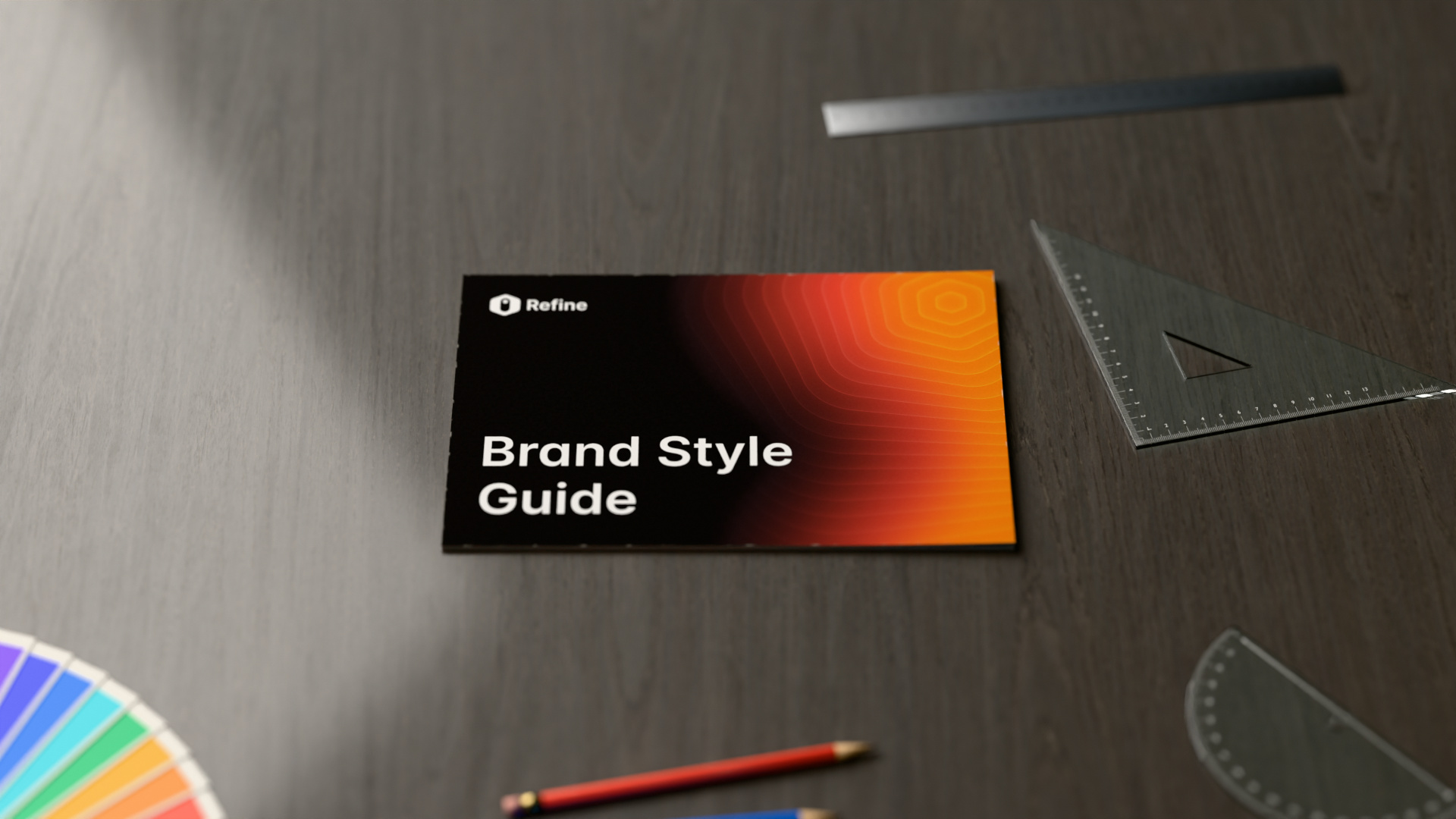
The closed Refine brand style guide booklet on a walnut desk.
The brand style guide. Logo, colour, type, grid and applications in 16 pages. Download the PDF.
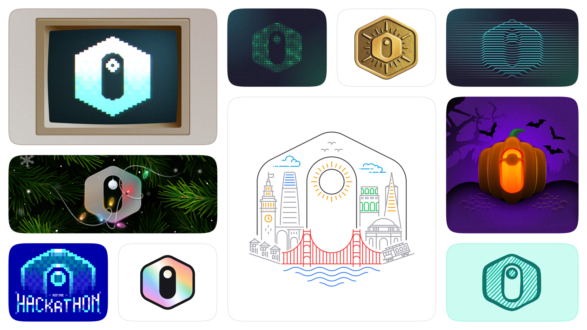
Variations of the logomark: on a retro computer screen, as a dot matrix, a gold badge, line art, a Halloween pumpkin, Christmas lights, a pixel-art Hackathon logo, a holographic sticker, a San Francisco skyline and a hand-drawn sketch.
Variations. The rules are loose by design: the mark changes with seasons, events and places.
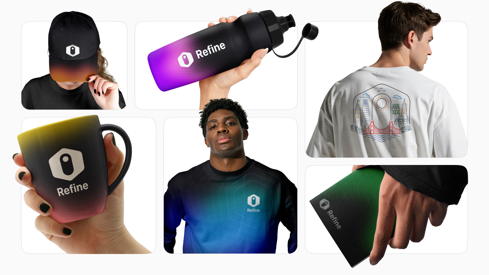
Refine merchandise with gradient colours: a cap, a water bottle, a mug, a sweatshirt, a T-shirt with the San Francisco line art and a notebook.
Merchandise. Gradient colours on caps, bottles, mugs and apparel for the community.

More works